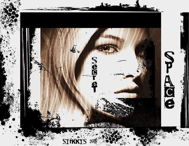
'Fortune-teller'
'Her secret place'
White space is used as efficiency means in a layout of a piece of paper, poster or other print.
However blank area must not be white.
However blank area must not be white.
It can be colored as well.
I made two collages in both ways. The first page has a colored blank space.
The other one is black and white, and the white color adds impressiveness of the image.
The 'Fortune-teller's image was cut out from my earlier made postcard and I think it's more effective being on a large blank background. I made shadowing to the image to emphasize mystery of picture.
The 'Fortune-teller's image was cut out from my earlier made postcard and I think it's more effective being on a large blank background. I made shadowing to the image to emphasize mystery of picture.
I show also typical samples of use of white space in which you can clearly see two different figures in the same picture.
You see black identical faces with ornaments and a white thing.
It is easy to turn a picture to a positive or negative form:
Thank you for looking.
*****
'Valkoinen tila' -teemaan tein kaksi työtä.
Valkoista tyhjää tilaa käytetään lisäämään painotuotteen layoutissa tehoa. Tilan ei kuitenkaan tarvitse olla valkoista, vaan blankko alue voi olla värillistä kuten 'Ennustaja'-kollaasissani. Lisäsin sen mysteeristä vaikutelmaa tekemällä varjon kuvaan.
Valkoista tyhjää tilaa käytetään lisäämään painotuotteen layoutissa tehoa. Tilan ei kuitenkaan tarvitse olla valkoista, vaan blankko alue voi olla värillistä kuten 'Ennustaja'-kollaasissani. Lisäsin sen mysteeristä vaikutelmaa tekemällä varjon kuvaan.
Lisäksi tein tyypilliset esimerkit tavasta, jolla samaan kuvaan saadaan kaksi erilaista kuviota. Ensimmäisessä tausta on valkoinen ja näet siinä mustat kasvot sekä valkoisen esineen.
Layoutin voi helposti kääntää positiiviseksi tai negatiiviseksi.


Both are amazing pieces. I didn't realise that white space could mean any other colour-thank you for sharing the info
VastaaPoistaEnjoy your day
Love Chrissie xx
Fantastic artwork.
VastaaPoistaLovely compositions!
VastaaPoistaFabulous art pages, I was really drawn to the beauty of the second page, its stunning.
VastaaPoistaYvonne xx
Wonderful and expressive creations for this theme!
VastaaPoistaI agree with you, Sirkkis. The term "white space" is midleading. It merely means uncluttered space, which may be of any color BUT uncluttered. I love your examples, and your explanation.
VastaaPoistaVery interesting and beautiful both pieces are superb.
VastaaPoistaThanks for your explanation of white space, Sirrkis. "White space" is misleading because, of course, it's all about the space and not the colour. Your two example pictures are superb. I love your artwork and we are so grateful that you post it on our blog challenge pages.
VastaaPoistaGreat pieces Sirkka, thanks for the explanation of white space.
VastaaPoistaAvril xx
A great exploration of white space - it really allows the focus to be on the important things.
VastaaPoistaAlison x
I meant also to say that I really like the notion of non-white blank space... that makes the whole idea open up. The secret space and intense face of the second page is really eye-catching.
VastaaPoistaAx
not only did you treat us to 2 lovely art pieces you also provided an art lesson! i've learned from this and next time i attempt a white space piece i will work from this knowledge. these two really are quite impressive! xo
VastaaPoistaThank you, Sirkkis, for opening up the idea of white/blank space. Both of your pieces are nothing less than impressive, my friend, and I send you some very loud applause.
VastaaPoista